


Build component library using Storybook
Storybook is an open-source tool for UI development that allows developers to build UI component library in isolation. Why and how to use it.


It serves as a "workshop" environment where you can see how components look and behave in various states without needing to embed them in your application's main UI. This makes it easier to develop, test, and document components. Why should you use it?
- Isolation: Develop components in isolation, which means that changes in one component won’t affect others. Which means that to see how components look and behave in various states, we don't need to embed them and navigate to that particular user journey. Look at storybook for popular video sdk, Agora. You can see each component and the states / controls it provides
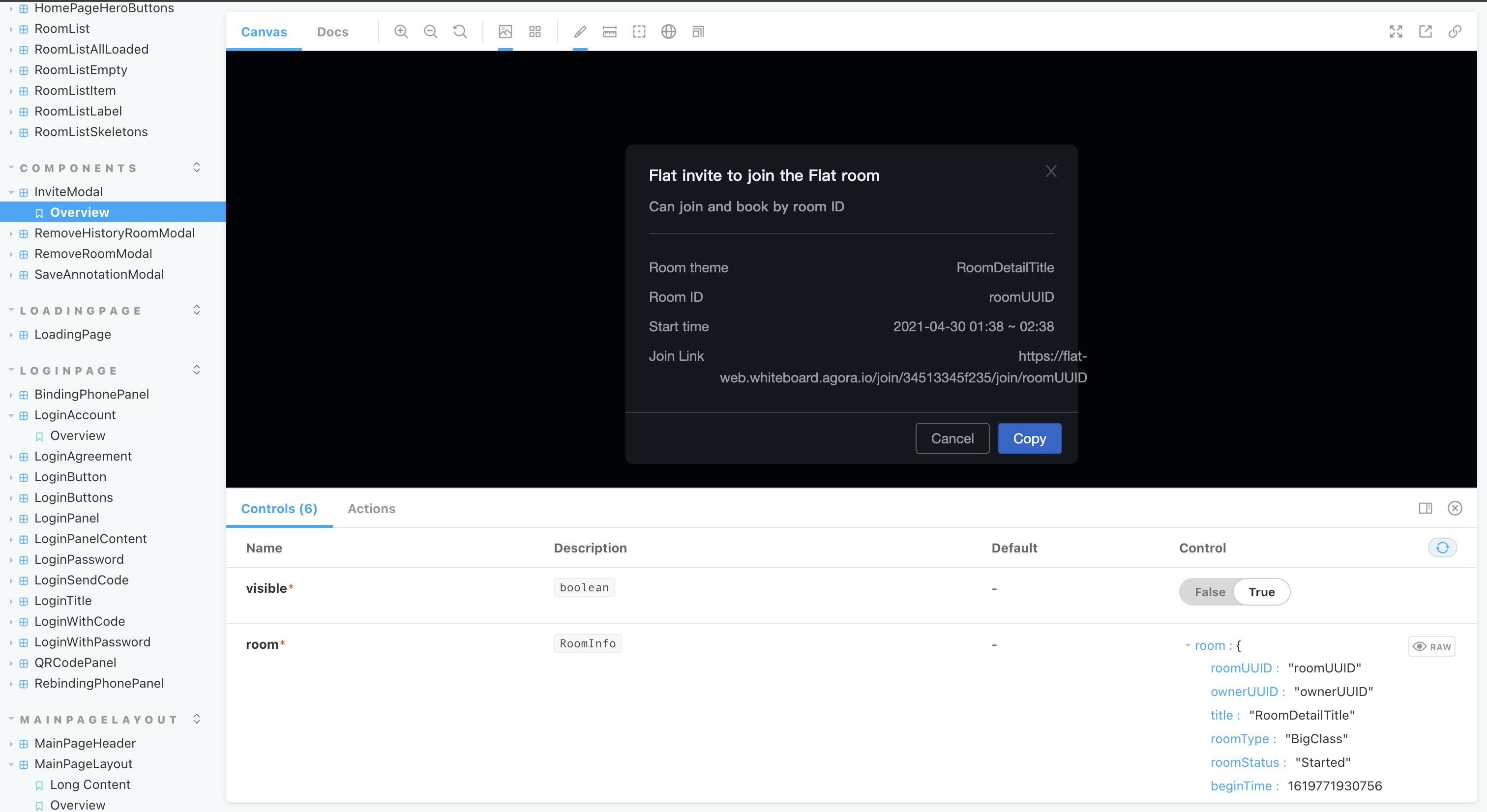
You can see their entire storybook here
Documentation: Generate documentation automatically, making it easier to share how components should be used. Often other developers are unaware of pre-existing components and end up creating their own version, which becomes a maintenance challenge.
Interactive Playground: Provides an interactive UI to play with component properties (knobs).
Visual Testing: Supports visual regression testing to catch visual bugs. Often visual regressions are hard to test with traditional e2e testing, visual testing helps in removing the manual inspection
Getting Started with Storybook
To start using Storybook, you typically integrate it into a project that's already set up with a UI framework like React, Vue, or Angular. Here’s how you can set it up in a React project:
Install Storybook:
If you have a React project set up, you can add Storybook by running the following command in your project directory:
npx sb initRun Storybook:
After installation, you can start the Storybook server with:
npm run storybookThis command will start the Storybook environment on a local server, typically accessible at
http://localhost:6006.Create a Story:
Stories in Storybook are JavaScript modules that define how to render a component. You write stories to display each state of your UI components. Here’s an example of a story for a simple
Buttoncomponent in a React project:// Button.stories.js import React from 'react'; import { Button } from './Button'; export default { title: 'Button', component: Button, }; export const Primary = () => <Button primary>Click me</Button>; export const Secondary = () => <Button>Click me</Button>;In this code:
titledefines the name of the component group in the Storybook UI.componentis the actual component being documented.PrimaryandSecondaryare variations of theButtoncomponent, known as "stories".
View Your Components in Storybook:
Once Storybook is running, you can navigate to its web interface where you will see the stories defined in your project. You can click on each story to view the rendered component and interact with it.
Documentation using Storybook
Storybook uses a feature called DocsPage to automatically generate documentation from your stories and code comments. Additionally, you can enhance documentation with Markdown or MDX (Markdown with JSX) to write narrative documentation.
Here’s how you can document your components in Storybook:
1. Set Up Documentation
Ensure that @storybook/addon-docs is installed and configured in your Storybook setup. This addon is often included by default when you initialize Storybook in your project. It parses your component and its comments to generate documentation.
2. Write Component Comments
Use JSDoc style comments in your component code to document props, states, and any other relevant information. Storybook's Docs addon can then automatically generate documentation from these comments.
For example:
// Button.js

/**
 * Primary UI component for user interaction.
 *
 * @param {Object} props - Props for button
 * @param {string} props.label - The text that the button will display
 * @param {function} props.onClick - The callback function to call on button click
 * @param {boolean} [props.disabled=false] - Whether the button is disabled
 */
const Button = ({ label, onClick, disabled = false }) => (
    <button disabled={disabled} onClick={onClick}>
        {label}
    </button>
);

export default Button;
3. Create Stories with Args
In your stories, define args for your component to show different states and prop configurations. Storybook will use these args to render controls and actions in the DocsPage.
// Button.stories.js
import React from 'react';
import Button from './Button';

export default {
  title: 'Components/Button',
  component: Button,
};

const Template = (args) => <Button {...args} />;

export const Primary = Template.bind({});
Primary.args = {
  label: 'Click Me',
  disabled: false,
  onClick: () => alert('Clicked!'),
};
4. Enhance with MDX
For more detailed documentation, you can use MDX. Create an MDX file where you can mix Markdown text with live Storybook previews.
// Button.stories.mdx
import { Meta, Story, ArgsTable, Canvas } from '@storybook/addon-docs';
import Button from './Button';

<Meta title="Components/Button" component={Button} />

# Button Component

The Button component is used for user interactions.

## Props

<ArgsTable of={Button} />

## Usage

<Canvas>
  <Story name="Primary" args={{ label: 'Hello', disabled: false }}>
    {Template}
  </Story>
</Canvas>
In this MDX file, Meta sets the component metadata, ArgsTable generates a table of the component's props, and Canvas and Story are used to render live previews.
5. Run and Review
Run Storybook to see your documentation in action. Navigate to your component in the Storybook UI, and you should see the generated DocsPage with your component’s documentation, including the interactive props table and live examples.
Documentation makes it easier for developers to understand and use your component library effectively.
Storybook offers a robust platform for building, documenting, and testing UI components in isolation. By integrating Storybook into your development workflow, you can create a well-structured, easily navigable, and thoroughly documented component library. This not only speeds up the development process but also ensures a consistent design and user experience across your projects.